

A paint chip can look like a quiet off-white under store lighting, then turn pink, gray, or surprisingly yellow once it reaches your living room. That is why the most useful interior paint color trends are less about chasing a single viral shade and more about choosing colors that work with your home’s light, fixed finishes, and everyday wear.
Table Of Content
- Interior Paint Color Trends Are Getting Warmer
- Warm whites replace harsh, bright whites
- Grounded Greens and Blues Bring Color Back
- Deep, Earthy Colors Are Best Used With a Plan
- Ceilings and trim are part of the color decision
- Choose a Trend That Fits Your Existing Home
- A Practical Sampling Process That Prevents Regret
- Match the Finish to the Job
Understanding the latest interior paint color trends can help you create a space that feels both modern and inviting.
For 2026, the direction is noticeably warmer, more grounded, and more personal. Cool builder gray is giving way to soft mineral neutrals, earthy greens, muddied blues, and carefully placed deeper colors. The goal is not to make every room dramatic. It is to make a home feel settled, comfortable, and intentionally yours.
Staying in tune with interior paint color trends ensures your home reflects contemporary aesthetics.
Interior Paint Color Trends Are Getting Warmer
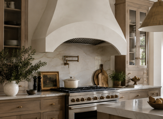
The dominant shift is away from stark, cold interiors and toward colors with a little softness underneath them. Think warm white instead of bright white, mushroom instead of flat gray, and tan or putty instead of beige with a yellow cast. These are flexible colors, but they do not have to feel bland.
These interior paint color trends allow for personal expression while maintaining a stylish look.
Warm neutrals earn their popularity because they solve a practical homeowner problem: they work around the finishes most people are not replacing this year. Honey oak floors, brick fireplaces, cream tile, brown leather furniture, and natural wood cabinets all tend to look more at home next to a neutral with warmth in it.
By incorporating popular interior paint color trends, you can make your home feel warm and inviting.
That does not mean every warm neutral works everywhere. A beige that looks polished in a south-facing family room can become heavy in a dim north-facing hallway. Before committing, paint large sample boards or use peel-and-stick samples on more than one wall. Watch them in morning light, afternoon light, and with the lamps you use at night.
Warm whites replace harsh, bright whites
A pure bright white can still be the right choice for a crisp modern kitchen, trim against a saturated wall, or a room flooded with daylight. But for most established homes, soft whites are easier to live with. Look for whites with subtle cream, taupe, or greige undertones rather than a blue-gray cast.
This is especially helpful in living rooms, bedrooms, and open-concept spaces where white covers a lot of wall area. The room still feels bright, but it loses the chilly, unfinished feeling that an overly stark white can create.
Grounded Greens and Blues Bring Color Back
Embracing grounded greens and blues in your interior paint color trends can rejuvenate your living spaces.
Homeowners are using color again, just with more restraint than the bold accent-wall era. The strongest shades feel pulled from nature: olive, moss, eucalyptus, deep sage, smoky blue, slate, and muted denim. They are calm enough for daily life while bringing more character than another neutral wall.
Green is particularly versatile because it can read as traditional, modern, rustic, or tailored depending on the shade and surrounding materials. A dusty sage works well in a bedroom or bath. A mid-tone olive can make a dining room feel welcoming. Deep forest green adds weight to a home office, library, or built-in cabinetry.
These interior paint color trends affect how we perceive our surroundings and can enhance well-being.
Blue is moving away from icy aqua and bright navy toward softened, grayed-out versions. A muted blue can support a restful bedroom, while a deeper ink or blue-black creates a strong backdrop in a dining room or powder room. In smaller spaces, a saturated color can feel more intentional than trying to make the room disappear under pale paint.
The trade-off is light absorption. Dark and mid-tone colors often need more coats than light walls, especially when covering a contrasting color. They also show scuffs more easily in busy hallways and around children’s bedrooms. Budget for quality paint, proper prep, and a small amount for future touch-ups.
Deep, Earthy Colors Are Best Used With a Plan
Rich brown, oxblood, charcoal, aubergine, and near-black are gaining ground in rooms where homeowners want atmosphere. These are not necessarily whole-house colors. They work best where the room has a clear purpose and can handle a more enveloping mood.
Deep, earthy colors are making a comeback in interior paint color trends, perfect for creating cozy atmospheres.
A moody dining room can make weeknight meals feel a little more special. A dark powder room can be memorable without demanding gallons of paint. In a den, deep brown or charcoal can help a television blend in rather than dominate the wall.
Try a full-room approach instead of painting only one feature wall. When the walls, trim, and even the ceiling are painted in related tones, the result looks deliberate. This technique is often called color drenching, and it can make a small room feel cohesive rather than chopped up.
Still, color drenching is not automatic. Rooms with low ceilings, limited daylight, or a lot of mismatched furniture may feel closed in with a very dark shade. If you love the idea but are unsure, start with a powder room, office, or bedroom that has a door you can close.
Ceilings and trim are part of the color decision
One of the more useful interior paint color trends is treating ceilings and trim as design elements, not afterthoughts. A ceiling painted a pale version of the wall color can soften the visual break at the top of the room. A muted blue ceiling in a porch-like sunroom or bedroom can add personality without overwhelming the walls.
Incorporating ceilings and trim into your interior paint color trends can elevate your design.
Trim is also shifting away from default bright white in some homes. Matching trim to the wall creates a quieter, more architectural look. Painting it a contrasting deep shade can highlight window casings, baseboards, and built-ins. The right choice depends on their condition: detailed, well-maintained trim is worth emphasizing, while thin or damaged trim may look better blended into the wall color.
Choose a Trend That Fits Your Existing Home
Paint is affordable compared with flooring, cabinets, or countertops, but repainting a whole first floor still costs real money and time. A practical color plan begins with what is staying.
Assessing the latest interior paint color trends can help you make informed decisions on your home’s aesthetic.
First, identify the undertones in your fixed elements. Flooring may lean orange, red, gray, or yellow. Countertops may contain cream, black, blue-gray, or warm brown flecks. Brick can have pink, rust, or purple notes. Hold paint samples directly beside these surfaces instead of judging them in isolation.
Next, consider the light. North-facing rooms often make colors look cooler and flatter, so a warmer neutral or warmer green usually helps. South-facing rooms receive stronger, warmer light and can handle colors with gray or blue undertones. East- and west-facing rooms change dramatically over the course of the day, making in-room testing especially important.
Finally, think about traffic and purpose. A restful bedroom can support a soft, low-contrast palette. An entryway may benefit from a medium or deeper color that hides the occasional bag scuff. A kitchen needs to coordinate with cabinets and backsplashes, but it should also feel clean under task lighting.
A Practical Sampling Process That Prevents Regret
Utilizing a practical sampling process can help you align with the current interior paint color trends.
Do not choose from a two-inch chip alone. Narrow the field to three or four options, then test them at home before buying gallons. This small step can prevent an expensive do-over.
Paint sample boards large enough to show the color clearly, preferably at least 12 by 12 inches. Use two coats so the old wall color does not distort the result. Move each board around the room and compare it near floors, upholstery, cabinets, and window trim.
Check samples under daylight and artificial light. If your room is mostly used at night, the color under your actual bulbs matters more than its appearance at noon. Warm bulbs can intensify yellow and red undertones, while cooler LEDs can make warm neutrals look duller or grayer.
For a connected layout, choose a simple palette rather than forcing the same color everywhere. One main neutral, one complementary lighter or darker neutral, and one or two accent colors can create continuity while letting each room have its own character.
Match the Finish to the Job
Choosing the right finish in line with interior paint color trends can significantly impact the final look.
Color gets the attention, but sheen affects how the finished wall performs. Flat and matte finishes hide small drywall flaws well, making them a good fit for ceilings and low-traffic bedrooms. Eggshell and satin are popular wall finishes because they offer modest washability without a strong shine.
Semi-gloss remains a practical choice for trim, doors, and cabinets because it stands up to cleaning. The downside is that shinier finishes reveal surface defects, so patching, sanding, and priming matter more. If your walls have old repairs, do not expect a trendy dark color in satin paint to hide them.
Combining the right sheen with your color choices ensures that your interior paint color trends are visually appealing.
A fresh color does not need to be the loudest choice on the paint deck to change how your home feels. Pick the shade that looks right in your own light, works with the things you already own, and makes you glad to walk through the door. That is a trend worth keeping.
Ultimately, embracing current interior paint color trends can transform your home into a personalized sanctuary.